Visual consistency is the first casualty in product design.
Teams usually start building an interface with a small, open-source pack like Feather or Heroicons. These sets are excellent, clean, and free. But they are finite. Eventually, you need a specific asset-perhaps a “receipt scanner” or a “drone delivery”-that the small pack lacks.
That moment breaks the system. Designers hunt for a similar-looking icon on a different site or waste hours drawing one from scratch. The result is a Frankenstein interface with mismatched stroke weights and varied corner radii.
Icons8 tackles this problem with brute force.
Instead of a marketplace hosting mismatched styles from thousands of contributors, it operates as a single, massive factory. The library holds over 1.4 million icons. Yet, total volume isn’t the metric that matters. The real value lies in the depth of individual style packs. With over 10,000 icons per style, the promise is simple: you never run out of assets that match your established design language.
Navigating The Style Ecosystem
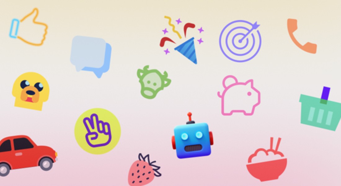
You have access to 45+ distinct aesthetic lanes. These range from strict utility sets to decorative, illustrative styles.
Platform-specific categories do the heavy lifting for application design. The iOS 17 pack alone contains over 30,000 icons, available in Outlined, Filled, and Glyph variants. A team can build an entire iOS-compliant application without ever designing a system icon.
Windows 11 and Material Outlined packs follow suit, strictly adhering to Microsoft and Google guidelines.
For marketing or presentation decks, the utility focus shifts to visual impact. Styles like “3D Fluency” and “Liquid Glass” offer high-fidelity assets. These bridge the gap between standard iconography and spot illustrations, adding depth to flat layouts.
Workflow Scenario: The UI/UX Designer
Picture a product designer porting an existing iOS application to Android. The original design relies heavily on the “iOS 17 Outlined” style.
In a typical workflow, this is a nightmare. The designer must audit every icon and find a Google Material equivalent. Visual friction is inevitable. Strokes won’t match. Sizes will be off.
Using the Icons8 Figma plugin or the Mac app (Pichon), the dynamic changes. You select elements in the interface and swap the library source. Because naming conventions map across styles, searching for “settings” or “user profile” in the Material Outlined pack yields an icon conceptually identical to the iOS version but stylistically correct for Android.
Designers can drag and drop vector assets directly onto the canvas. If the brand uses a specific primary color, apply a bulk recolor within the Icons8 interface before export. Every asset lands in the design file with the correct hex code already applied.
Workflow Scenario: The Front-End Developer
Hand-offs between design and engineering are rarely smooth. SVGs often arrive with messy code, unnecessary grouping, or clipping masks that break CSS styling.
Developers using Icons8 bypass the manual export process entirely. Once a collection is finalized, assets are accessible directly via the browser.
For a React application, the “Simplified SVG” option is a lifesaver. It strips away unnecessary metadata and merges paths where possible. You get clean, lightweight code that responds predictably to CSS.
Need a quick prototype? Grab the CDN link or Base64 code snippet. You can embed the icon immediately without managing local asset files. For mobile applications, Lottie JSON files are available. Complex animations-like a “success” checkmark or a loading spinner-can be implemented without the heavy file size of a GIF.
A Narrative: Building a Pitch Deck
Let’s look at a typical Tuesday morning for a marketing manager building a slide deck.
The manager opens the in-browser editor. The presentation needs a friendly vibe, so they filter by the “Hand Drawn” style. They need to visualize a data segment. A search for “analytics graph” returns hundreds of results. To add movement, they filter for “animated” and download a clean JSON file.
Next, the final slide needs contact info. The manager searches for an instagram logo for the footer. The default color is black, but the slide background is dark blue.
Opening Photoshop is unnecessary. They click the icon to open the editor, select the “Recolor” tool, and input the company’s white-and-gold palette. The icon looks too thin next to bold text, so they use the “Stroke” feature to bump the border thickness by 2 pixels. Finally, they download a 1600px PNG to ensure it looks crisp on a 4K monitor.
Three minutes. Done.
Limitations and When to Look Elsewhere
This library is a utility, not a magic wand. It isn’t the right solution for every project.
Unique Branding
If your goal is a design language that feels entirely proprietary, stock libraries will always fall short. Icons8 is ubiquitous. You will see these icons on other websites. “Cookie-cutter” is the price of convenience.
The Free Tier
The free plan works for testing but restricts production. PNG downloads are capped at 100px-insufficient for retina displays-and link attribution is mandatory. Professional work effectively requires a subscription.
Artistic Specificity
The library has illustrative styles, but it lacks the chaotic variety of a marketplace like The Noun Project. If you need a specific, quirky artistic interpretation of a concept, a standardized library often feels too rigid.
Alternative Approaches
Open Source Packs (Feather, Heroicons)
Best for developers on a budget who need high-quality SVGs. They are free and code-friendly. The catch is size. Most open-source packs have fewer than 300 icons. You will hit a wall.
Flaticon
The closest competitor in volume. Flaticon operates as a marketplace for many different designers. You get greater stylistic variety but significantly less consistency. Finding a pack of 10,000 icons by a single artist is rare here.
In-House Design
The gold standard. You get exactly what you want, and you own the IP. But the cost is massive. Maintaining a custom set of 1,000+ icons requires hundreds of designer hours.
Practical Tips for Power Users
Use Collections for Batching
Don’t download icons one by one. Drag everything you need into a Collection as you browse. When you finish, apply a single color change to the whole batch and download them as a sprite or a ZIP of SVGs.
Check the “Simplified” Box
Always use the “Simplified” option for web SVGs. It removes the ability to edit paths later but significantly reduces code bloat. Your HTML stays clean.
Request Missing Assets
Paid plans include a Request feature. It isn’t a suggestion box that gets ignored; the company produces icons based on these votes. If a request gets 8 likes from the community, it enters the production pipeline.
Check the “Popular” Category
On a tight budget? The Popular, Logos, and Characters categories are free to use without the 100px limit, provided you include a link. This usually suffices for student projects or personal blogs.
Icons8 solves the “buy vs. build” dilemma. It offers a middle ground where teams access a massive, consistent system without the overhead of maintaining it. For those prioritizing speed and visual uniformity, it is a vital tool.

