
If you have ever stared at a spreadsheet full of data and wondered how to turn it into something people will actually look at, you are not alone. Pie and donut charts are among the most universally recognized data visualization formats, but creating a version that looks polished and professional is not always straightforward. The good news is that today’s design platforms have made it easier than ever to build beautiful, accurate charts without a degree in graphic design or data science. This article walks you through what to look for in a chart-making platform and shares practical tips for choosing and using the right tool for your needs.
Why Pie and Donut Charts Still Matter
Before diving into the tools themselves, it helps to understand why pie and donut charts remain so popular across industries. These chart types are exceptionally good at one specific job: showing part-to-whole relationships at a glance. Whether you are presenting quarterly revenue breakdowns, survey results, demographic distributions, or budget allocations, a well-designed pie or donut chart communicates proportions faster than a table or a paragraph of text ever could.
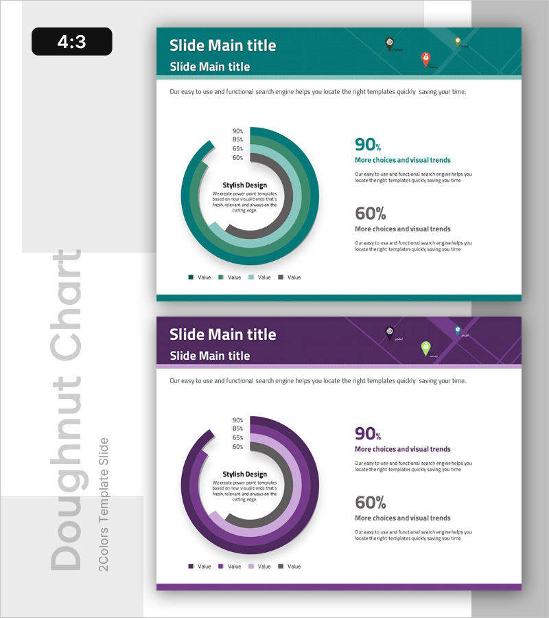
Donut charts, in particular, have grown in popularity because they offer the same proportional clarity as pie charts while also creating a visual “center stage” in the middle of the graphic. That center space can be used to display a total number, a key metric, or even a brief label, making the chart simultaneously more informative and more visually balanced. Both formats are standard in dashboards, presentations, annual reports, and marketing materials, which means knowing how to create them well is a genuinely useful professional skill.
The challenge, of course, is that not every design tool handles these chart types with the same level of quality or ease. Some platforms are built primarily for illustration and feel clunky when it comes to data-driven graphics. Others are technically capable but come with a steep learning curve. The platforms worth your time are the ones that combine professional-grade templates with an intuitive interface.
What to Look for in a Chart Design Platform
Not all chart tools are created equal, and the difference between a frustrating experience and a smooth one often comes down to a handful of key features. Here is what you should evaluate before committing to any platform.
Template Quality and Variety A good library of pre-designed templates is the single fastest way to achieve professional results. Look for platforms that offer templates across a range of visual styles, from clean and minimal to bold and colorful, so you can find something that fits your brand or the tone of your presentation. Templates should also be fully customizable, meaning you can adjust colors, fonts, labels, and segment sizes without having to rebuild the chart from scratch.
Ease of Data Input The best platforms allow you to enter or paste data directly into the tool rather than requiring you to configure a chart through a complex series of menus. Some tools offer direct spreadsheet integration, pulling data automatically from a connected file. Others use a simple input table within the design interface. Either approach works well; what matters is that the process feels intuitive rather than technical.
Export Options Think about how and where you plan to use your finished chart. If it is going into a slide deck, you may want a PNG or SVG file. If it is destined for a printed report, high-resolution PDF export becomes important. For digital dashboards or websites, SVG format is often preferred because it scales without losing quality. A versatile platform will support multiple export formats and give you control over resolution.
Brand Customization For professional use, your chart needs to match your brand’s visual identity. That means being able to apply your specific brand colors, use your preferred fonts, and include your logo if needed. Platforms that support custom color palettes and font uploads are significantly more useful for business applications than those with only fixed style options.
Collaboration Features If you are working with a team, look for platforms that allow multiple users to access and edit a design. Cloud-based tools with shareable links and comment features make it much easier to gather feedback and iterate on a chart without emailing files back and forth.
10 Tips for Creating Better Pie and Donut Charts
1. Start with a Professional Template, Then Customize
One of the biggest mistakes people make when building charts is starting from a blank canvas. While that approach gives you total control, it also means every design decision falls on you, and the results can look inconsistent or amateurish without a trained eye. Starting from a well-designed template gives you a professional foundation and lets you focus your energy on the data itself rather than the layout. Most top platforms offer dozens of chart templates organized by use case, industry, or visual style.
When you find a template you like, resist the urge to use it exactly as-is. Swap in your own brand colors, adjust the font sizes for legibility, and make sure the labels are clear and positioned sensibly. A customized template looks intentional and polished in a way that a completely untouched one does not.
2. Use Adobe Express to Build Charts Quickly
For a tool that genuinely balances professional output with ease of use, Adobe Express stands out as one of the strongest options available. You can make a chart using a library of templates designed for clarity and visual impact, with controls that make data entry and customization straightforward even for non-designers. Adobe Express supports a range of chart types including pie and donut formats, and it integrates with Adobe’s broader design ecosystem, which is a major advantage if you already use Adobe tools in your workflow.
What makes Adobe Express particularly practical for professional users is the combination of quality templates, flexible customization, and easy export. You can match your chart to your exact brand palette, adjust typography, and download your finished chart in formats suitable for print, web, or presentation. For teams, the platform also supports shared assets and brand kits, so everyone is working with the same visual standards.
3. Limit Your Chart to Five Segments or Fewer
This is a design principle worth taking seriously regardless of which platform you use. Pie and donut charts become difficult to read when they are divided into too many segments. Small slices are hard to label clearly, the color differences between segments become subtle, and the visual hierarchy that makes the chart useful in the first place starts to break down.
As a general rule, aim for no more than five segments. If your data has more categories than that, consider grouping smaller values into an “Other” category, or think about whether a different chart type, such as a bar chart, might actually serve your data better. A chart that is easy to read at a glance is always more effective than one that is technically complete but visually overwhelming.
4. Choose Colors That Communicate, Not Just Decorate
Color is one of the most powerful tools in data visualization, and it is also one of the most commonly misused. In a pie or donut chart, each segment’s color should be distinct enough to be clearly differentiated, but the overall palette should still feel cohesive. Avoid using colors that are too similar in hue or value, since they will blur together, especially when the chart is viewed at a small size or printed in lower resolution.
It is also worth thinking about color associations. In many business contexts, for example, green signals positive or favorable data while red signals negative or unfavorable. Using these associations intentionally, or being aware of them when you are not using them intentionally, helps your audience interpret your chart correctly and quickly.
5. Always Label Your Segments Clearly
There is ongoing debate in data visualization circles about whether pie and donut charts should use direct labels, a legend, or both. In most cases, direct labels on or near each segment are the clearest option. They eliminate the need for the viewer’s eye to travel back and forth between the chart and a legend, which slows comprehension and increases the chance of misreading.
Good labels include both the category name and the percentage value. If space is tight, percentage-only labels can work, but they require the viewer to already know what each segment represents, which is not always a safe assumption. Look for platforms that give you full control over label placement, font size, and color contrast so your labels are always legible regardless of the segment’s background color.
6. Use the Donut Format to Add a Central Metric
If you are working with a donut chart, take advantage of that center space. Adding a key number or short phrase in the center of the chart does two things: it gives the viewer an anchor point and it makes the chart more information-dense without adding visual clutter. Common uses for the center space include the total count being represented, the dominant percentage, a category label, or even a small icon.
Most professional chart templates include a placeholder for center text in donut chart formats, making it easy to add this element without manual positioning. Just make sure the text size and font weight are appropriate for the size of the chart and that the center content complements rather than competes with the segment labels.
7. Match Your Chart Style to Its Context
A chart for a boardroom presentation has different visual expectations than one for a social media post or an internal team dashboard. Professional presentations tend to call for clean lines, restrained color palettes, and readable typography. Social media graphics can support bolder colors, more personality, and a less formal layout. Internal dashboards prioritize clarity and speed of reading over visual flair.
Before you start designing, think about where the chart will live and who will be looking at it. That context should inform your template choice, your color approach, and how much explanatory text you include. A chart that is perfectly calibrated for its context will always feel more intentional and communicate more effectively than one that was designed without that consideration.
8. Optimize for the Size at Which It Will Be Viewed
Charts that look great at full screen can become illegible at smaller sizes, and the reverse is also true: a chart designed for a small dashboard widget may look oversimplified and sparse when blown up to fill a slide. Always preview your chart at the actual size it will be displayed before finalizing it.
Pay particular attention to text size and stroke weight at smaller sizes. Labels, percentages, and legend text can become too small to read when a chart is scaled down, which defeats the purpose of including them. Most professional platforms let you preview your design at different dimensions before exporting, which is a step worth taking before considering a chart finished.
9. Take Advantage of Animation When the Format Allows
If your chart is going into a digital format, such as a web page, a digital presentation, or an interactive dashboard, consider whether animation might enhance it. A donut chart that fills in segment by segment, for example, creates a natural sense of reveal and draws the viewer’s attention through the data in a controlled sequence. This can be especially effective in presentations where you want to walk your audience through the numbers one piece at a time.
Not every platform supports animated charts, but those that do often make it easy to apply animations without any coding. Just be judicious: animation should serve the story the data tells, not exist purely for visual novelty.
10. Save Your Design as a Reusable Template
Once you have invested the time in creating a well-designed chart, do not let that work disappear after a single use. Save your finished design as a template that you can return to for future projects. This is especially valuable if you produce recurring reports, like monthly performance summaries or quarterly business reviews, where consistent visual branding across updates signals professionalism and reliability.
Many cloud-based design platforms allow you to save custom templates within your account. Some even allow you to set up brand kits that automatically apply your preferred colors and fonts to any new design, which dramatically reduces setup time for repeat projects.
FAQ
What is the difference between a pie chart and a donut chart, and when should I use each?
Pie and donut charts visualize the same type of data, specifically how individual parts make up a whole, but they differ in visual structure and a few practical advantages. A pie chart is a solid circle divided into wedge-shaped segments, while a donut chart has a hollow center. Beyond aesthetics, the donut format offers a functional benefit: that open center can display a summary statistic, label, or icon, making the chart more information-rich without adding external clutter. In terms of readability, some research suggests that donut charts are actually slightly easier to interpret because the human eye compares arc lengths more accurately than it compares angles, which is what pie chart segments rely on. As a general rule, use a pie chart for simple, clean presentations where the full circular shape adds visual weight to your layout, and use a donut chart when you want to include a central metric or when the chart will appear at a smaller size and readability is a priority.
How many data points should a pie or donut chart include?
The sweet spot for pie and donut charts is between three and five segments. This range allows for clear color differentiation, readable labels, and a visually balanced composition. When a chart has more than five or six segments, several problems tend to emerge: segments become too small to label clearly, color palettes grow difficult to distinguish, and the viewer has to work harder to extract meaning from the graphic. If your dataset has more categories than five, consider whether some of the smaller values can be responsibly grouped into an “Other” or “All Other” category without misleading your audience. If grouping is not appropriate for your data, it may be worth switching to a horizontal bar chart, which handles many categories much more gracefully than a circular format.
What file format should I export my chart in for different uses?
The right export format depends entirely on where your chart will be used. For digital presentations and slide decks, PNG is the most universally compatible format and renders crisply on most screens. For web use, SVG is the preferred option because it scales to any size without pixelation, which is important for responsive design. For print materials, high-resolution PDF or PNG at 300 DPI or higher is the standard to ensure the chart reproduces cleanly at print quality. If you are embedding a chart into a document editor like Google Docs or Microsoft Word, PNG typically offers the best balance of quality and compatibility. It is worth checking what export options your platform of choice supports before you start designing, especially if you have specific output requirements.
How can I make sure my pie or donut chart is accessible to people with color vision differences?
Accessibility is an important consideration for any data visualization, and pie and donut charts present a specific challenge because they rely heavily on color to distinguish between segments. To make charts more accessible, start by choosing a color palette that includes high contrast between adjacent segments. There are several free accessibility-focused color palette tools available online, including Colorbrewer 2.0, which was specifically designed for data visualization and includes colorblind-safe palette options. In addition to color, consider using pattern fills or texture variations to differentiate segments, and always include direct data labels so that the meaning of each segment is readable without relying on color alone. These steps make your chart interpretable for a wider audience, including people with various forms of color vision deficiency.
Can I use these chart types in professional reports and branded materials without design experience?
Absolutely, and this is one of the primary reasons purpose-built chart design platforms have become so popular. Modern chart tools are built around the assumption that most users are not trained graphic designers, and the best ones make it genuinely easy to produce professional-quality output through a combination of pre-designed templates, guided customization options, and brand kit features. You do not need to understand design theory or layout principles to produce a chart that looks polished and credible. What you do need is a clear understanding of your data, a platform with strong templates, and a willingness to spend a few minutes refining the default settings to match your specific context. Starting with a quality template, applying your brand colors, ensuring your labels are readable, and exporting at the appropriate resolution will get you most of the way to a professional result with minimal design knowledge required.
Conclusion
Pie and donut charts are some of the most effective tools in any communicator’s data visualization toolkit, and the platforms available today make creating professional versions more accessible than ever before. Whether you are putting together a quarterly report, a client presentation, or a social media graphic, the combination of strong templates, intuitive customization, and flexible export options found in today’s best design tools means you do not need to be a designer to produce something that looks like one made it.
The key is to approach chart design with both clarity and intention. Choose the right chart type for your data, keep your segment count manageable, prioritize legibility in your labels and colors, and select a platform that supports your workflow and output needs. With those principles in place and the right tools at your fingertips, turning raw data into a compelling, professional visual is well within reach for anyone.

